This collection of work includes examples of digital designs created for use in digital marketing.
(Click for full description)
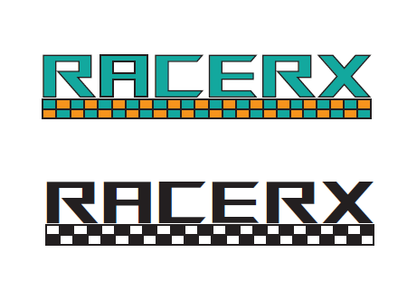
 RacerX Logo Design
The RacerX two-color logo design was created to establish a bold, recognizable identity for a racing or gaming-inspired brand. Its purpose is to communicate speed, energy, and competitiveness to a younger audience, such as gamers or motorsport enthusiasts. The design needed to be scalable, memorable, and effective in limited color applications. The concept centers on angular, geometric typography paired with a checkered pattern that references racing culture. Principles like contrast, repetition, and balance reinforce brand consistency, while the limited palette ensures versatility. This artifact showcases strong typography and logo design fundamentals, especially through its functionality in both color and monochrome versions. A unique aspect is the integration of the checkered motif as both a visual and conceptual element. Potential improvements include refining kerning and spacing and testing the logo in real-world mockups, which would improve clarity and presentation.
Tech Crowd Infographic
The Tech Crowd Data Analysis infographic was designed to communicate smartphone dependency trends across demographics through clear data visualization. Its purpose is to inform a broad audience—especially students and tech-aware users—about how income, race, and education influence reliance on smartphones. To be effective, the design needed to present complex data in a clear, accessible format. The concept emphasizes contrasts, such as the inverse relationship between income and dependency and disparities across racial groups. Strong hierarchy, consistent color coding, and clear labeling guide the viewer through multiple datasets, while alignment and proximity organize the layout into digestible sections. This artifact represents strong work because it demonstrates both analytical thinking and data storytelling. A unique aspect is the integration of multiple chart types within one cohesive design. Improvements could include refining spacing and increasing text contrast for accessibility, which would enhance readability and overall polish.

Scoop Shoppe Social Ad
This social media advertisement for Scoop Shoppe Artisan Creamery was designed to promote small-batch, handcrafted ice cream through a bright and playful visual style. The design uses bold colors, expressive typography, and engaging imagery to create an energetic and inviting tone that appeals to a broad audience. A clear visual hierarchy highlights the main message and call to action, guiding viewers toward ordering online while reinforcing the brand’s personality. Although originally created with animation to enhance engagement, the still version maintains strong visual impact and communicates the message effectively. This project highlights my ability to design eye-catching promotional content that translates across formats while maintaining brand consistency and clarity.

Fresh Fare Farms Carousel
This carousel advertisement was designed for Fresh Fare Farms to promote community involvement during Hunger Action Month while raising awareness about food insecurity. The design uses a sequence of visuals and messaging to guide the viewer through a narrative, beginning with meal preparation and leading to a broader call to action. Bright, contrasting colors and organic shapes create a friendly and engaging tone, while clear typography and visual hierarchy ensure the message is easy to follow across each panel. The layout balances imagery and text to maintain interest and readability, reinforcing both the brand identity and the campaign’s purpose. This project highlights my ability to design cohesive multi-frame advertisements that communicate a message effectively while maintaining strong visual consistency.


Future Funds Wireframe
This wireframe design was created for a financial planning website, Future Funds, with the goal of improving usability and clearly presenting services to first-time investors. The layout focuses on simplifying the user experience by prioritizing key features such as service offerings, a financial calculator, and account access. Structured sections like “What We Offer” and “Popular Plans” use hierarchy and visual grouping to guide users through the content while maintaining clarity and ease of navigation. The design emphasizes balance, spacing, and clear call-to-action elements to reduce cognitive overload and build user confidence. This project highlights my ability to identify usability issues and create intuitive, user-centered layouts that effectively communicate information in a clean and organized way.


