The following pieces were created for use in various print media forms just as magazine advertisements, brochures, etc.
(Click for full description)
 Book Cover Redesign
This book cover redesign, A Realm of Thorns and Nightmares, reimagines A Court of Thorns and Roses as a horror-inspired concept while retaining elements of fantasy. Designed for young adult readers (18–35) who enjoy dark fantasy and horror, the piece focuses on a bleeding rose as the central visual to convey a darker tone. Typography, imagery, and color choices were intentionally selected to create an unsettling atmosphere, while principles like hierarchy, contrast, and balance guide the viewer’s attention. This project demonstrates my ability to reinterpret existing concepts through a new genre and highlights my skills in typography, layout, and publication design, resulting in a polished and visually compelling final piece.

Magazine Advertisment
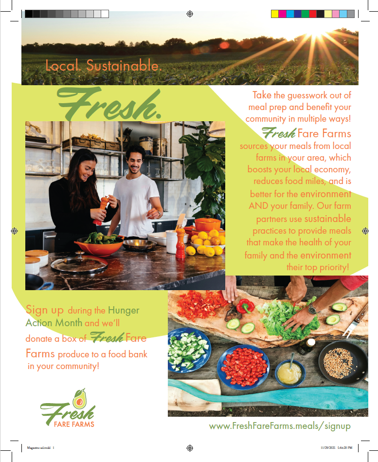
The Fresh Fare Farms magazine advertisement was designed to promote a sustainable meal kit service while encouraging community engagement. Its purpose is to persuade environmentally conscious consumers and families by highlighting local sourcing, sustainability, and social impact. To be effective, the design needed to balance strong visuals with clear messaging and a compelling call to action. The concept focuses on freshness and community, communicated through vibrant imagery, natural colors, and organic shapes. Hierarchy and emphasis guide the viewer from key phrases like “Fresh” and “Local. Sustainable.” to supporting details and the call to action. Principles such as contrast, alignment, and repetition create a cohesive layout. This artifact demonstrates strong layout, typography, and advertising design skills. A unique aspect is the layered imagery that adds depth while maintaining readability. Improvements could include tightening text spacing, simplifying some copy, and refining alignment to enhance clarity and overall effectiveness.
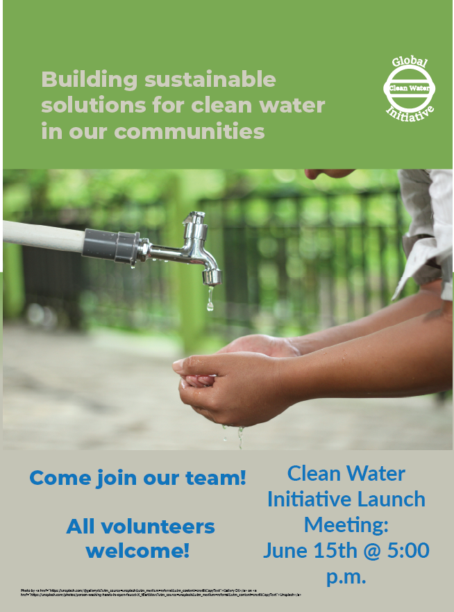
Clean Water Flyer
This flyer design for the Global Clean Water Initiative was created to promote a community-focused event and encourage volunteer participation. The layout emphasizes clear communication and visual impact, using a strong headline and large imagery to immediately convey the importance of clean water access . A structured hierarchy guides the viewer through key information such as the event details and call to action, ensuring the message is easy to understand at a glance. The use of color, typography, and spacing creates a balance between urgency and approachability, while reinforcing the organization’s mission. This project demonstrates my ability to design effective promotional materials that communicate a clear message while maintaining strong visual appeal and readability.
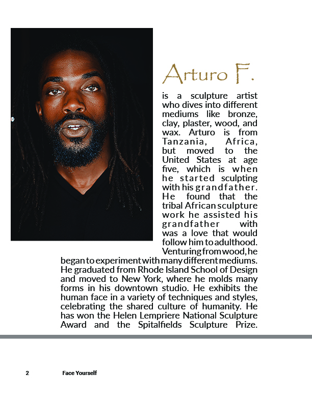
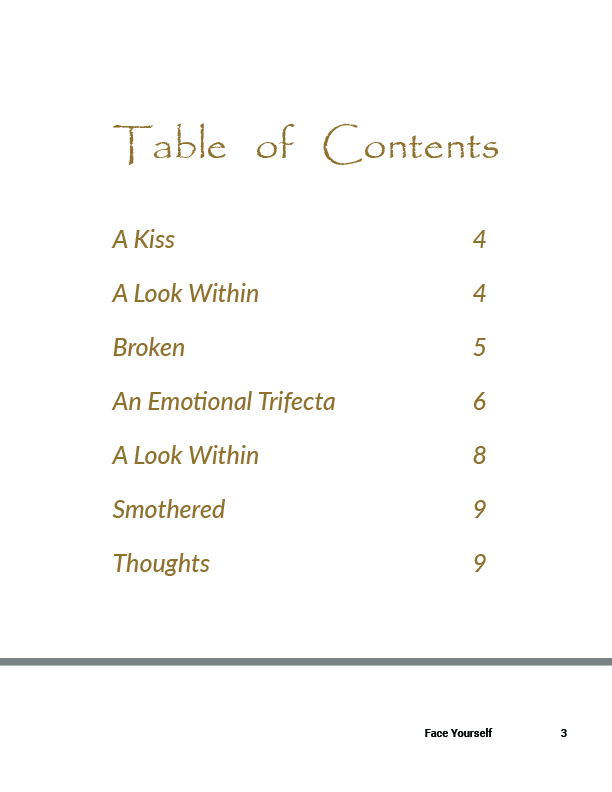
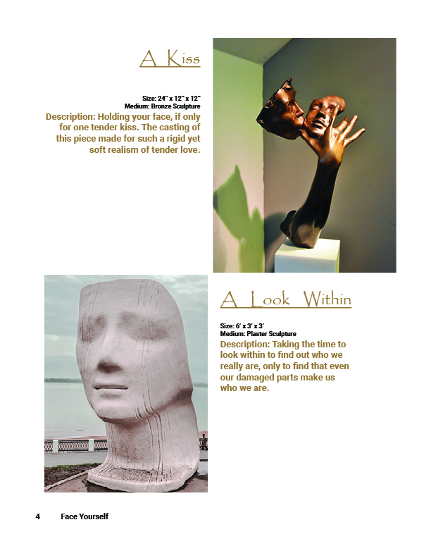
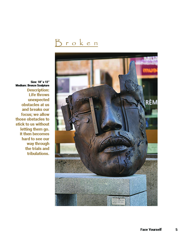
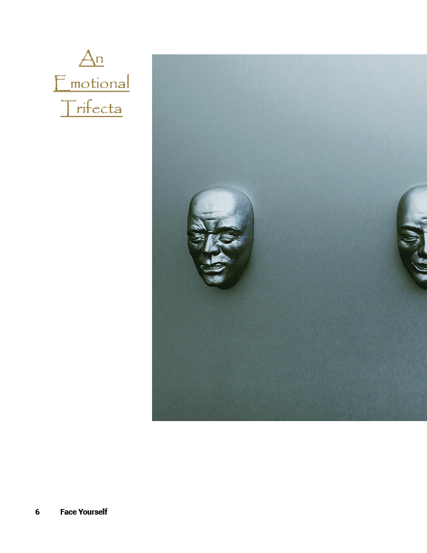
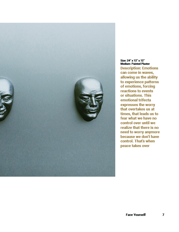
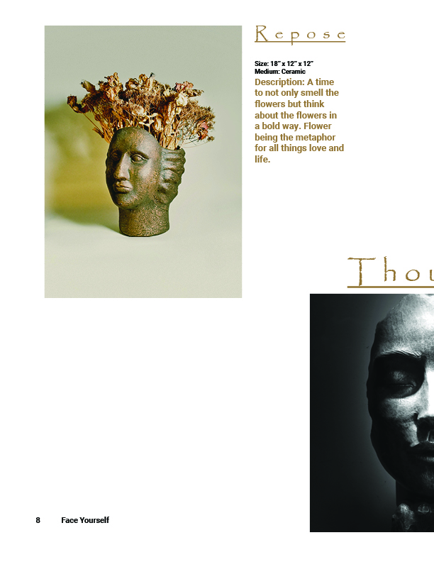
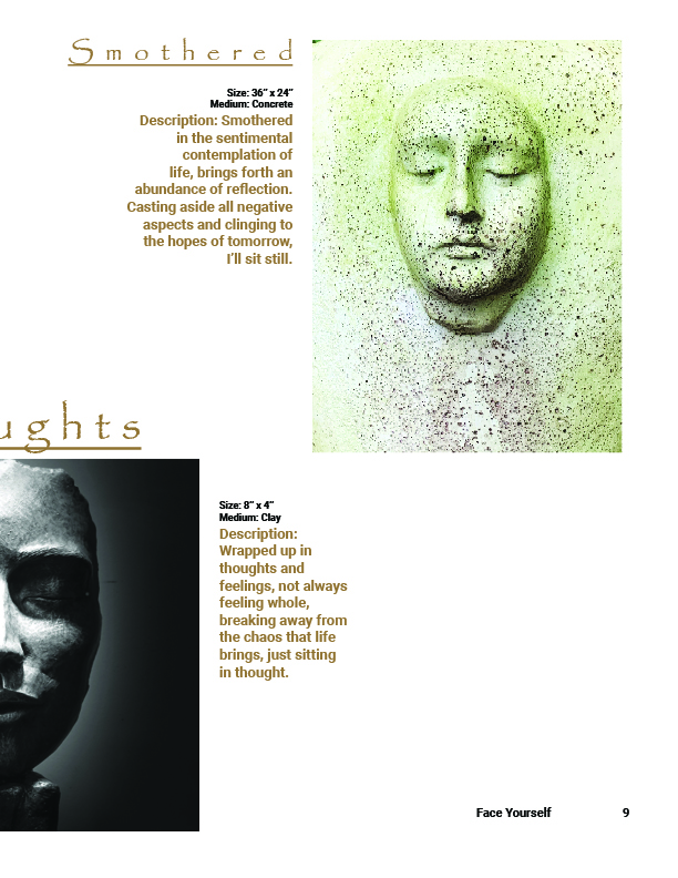
Face Yourself Catalog
This catalog design, Face Yourself, was created as a multi-page publication showcasing a series of sculptural works centered around themes of identity, emotion, and self-reflection. Designed to function as both an informational and visual experience, the catalog guides viewers through the collection using a structured layout, clear hierarchy, and consistent typography. Each spread balances imagery and descriptive content to highlight individual pieces while maintaining a cohesive visual flow throughout the publication. The use of negative space, alignment, and contrast helps direct attention and enhance readability, while the overall tone supports the introspective nature of the work. This project demonstrates my ability to design cohesive, print-ready publications and highlights my skills in layout design, typography, and visual storytelling across multiple pages.
Piddle Paddle Brochure
The Piddle Paddle Tours brochure is a promotional piece designed for a fictional tourism company to inform and attract families and travelers seeking outdoor adventure experiences. The design balances engaging visuals with clear, organized information, using bold imagery and vibrant text on the outer panels to capture attention, while the interior panels present detailed tour information in a structured, easy-to-follow layout. Emphasizing hierarchy, balance, and readability, the brochure guides users through the content while maintaining a fun and energetic tone. This project highlights my skills in layout design, typography, print formatting, and publication structure, resulting in a polished, print-ready marketing piece.


